Just as a journey of a thousand miles begins with a single step, so a painting of a million strokes begins, progresses, and ends with single ones.
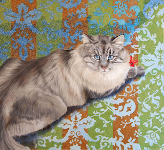
Here's the beginning of "Aslan" which promises to be a painting of very many strokes indeed.
With animal paintings I always begin with the eyes so that I have someone to talk to as I paint!
I did a smaller version of this same design a year ago when I was beginning pastel. I painted small portraits of different cats on different types of pastel paper to get a taste of the various choices. The small version of Aslan was on sanded paper which I didn't like AT ALL. It was way too messy with so much dust and it ate away at the patels with lightning speed. This time I'm using Pastelmat, continuing my investigation of this paper.
For the design around Aslan, I blocked in the color of the pattern then added the background color in wide striipes of green and brown. For the texture, I added tiny strokes of different colors over the ground color.

Several hours later, here's where I am. I have the background design in and have done some work on the cat. The background and cat's face is all done with pastel pencil. But I blocked in some preliminary color on the body with my Polychromos hard pastels. I really like these pastels. The set includes 7 gradations of cool grays and 7 gradations of warm grays - perfect for this cat.
At this point I discovered a problem. The smaller version I did last year worked with this pattern in the background, but I don't feel that this is working very well. I pulled out last year's piece and discovered that in that piece the background color was solid and the stripes were in the pattern. Yikes! I have it backwards - striped background and solid pattern. I like the original version a lot better. But clearly at this point I'm stuck.
It seems like it wouldn't make much difference, but in the older painting I faded the background above and behind the cat to a solid color, which worked well with the solid ground but won't work with the solid pattern. Hmmm. This is a problem that I'll have to solve, but at this point I don't have any idea how.
 More progress, continuing dilemmas, and new problems.
I've done more work on the cat, adding detail with pastel pencil.
I needed the mouse to stand out, so I made him red. But now I have a color scheme problem. How can I make the red fit? Red is related to the brown in the background and in the cat's fur, but it doesn't seem like enough. Something to ponder.
Meanwhile, I'm having trouble with the area behind and above the cat. I'm thrown because I thought I was doing what I had done in my earlier painting, but inadvertantly introduced a crucial difference.
I had trouble with the shadow under Aslan. My hope was that after several layers of pastel - there are four layers of pastel pencil over the background pattern - I could add a glaze with a soft pastel. But this was not the case. Apparently enough of the texture of the Pastelmat remains that it scratches pigment from the soft pastel unevenly. I'll have to do a separate experiment and see if I can eventually get a glaze if I have enough pastel built up on the Pastelmat.
I have a lot of major problems to solve - coming up with an integrating color scheme, getting the shadow under Aslan the correct hue and value, and what to do with the background behind and above the cat.
No comments:
Post a Comment