Friday, December 31, 2010

Looking Back

detail from my beaded necklace, "Mystic Pool"
2010 was a good art year for me. My pieces were well-received in several shows. I was able to sell over $3,000 of art work and donate the money to animal charities. Challenges presented themselves for the future. And directions became clearer in a few significant ways. I also re-built my web site and finally got serious with this blog that I had started late in 2009.


In terms of the shows, the highlight was being a finalist in Kalmbach’s 2010 Bead Dreams Show in the polymer clay category. This is an international show. I don’t know the number of entries, but wouldn’t be surprised if there are hundreds in each category. My piece was one of five finalists, so I am very pleased.

Firemountain Gems accepted five of my pieces as finalists, one in the seed bead category, and four in the polymer clay category. One of the polymer clay pieces, the “Christmas Dreams” necklace, won the gold medal in its category. Firemountain Gems does a fabulous job of recognizing its artists and I really appreciate their efforts. They sent me lovely certificates with professional photos of my pieces, as well as copies of three full page ads, each featuring one of my pieces, which they will be using in advertising.

My “Paradise” gourd won first prize in the American Gourd Society’s quarterly competition in the spring. The theme was mixed media and they printed a nice photo as well as a brief bio in their official magazine.

Sierra Pastel Society awarded me Signature Status. I was one of two members awarded this status this year.

My pastel portrait of our beloved squirrel Sparkle won an Award of Merit in PAA’s annual national juried Mother Lode Show held at the Shakespeare Club in Placerville.

My pastel portrait of a sweet kitten, “Badger,” won an Award of Merit in Sierra Pastel Society’s bi-annual national juried show, “Pastels on High,” held at Hang It Up Gallery in El Dorado Hills.

In terms of sales, I made several “one off” sales during the year and also participated in two sales opportunities, PAA’s Studio Tour and EDAC’s Holiday Market. This year I completed my first two commissioned pet portraits and also sold one of the portraits that I had painted as a sample. I was thrilled to distribute the money I made to animal charities: PAWED (People for Animal Welfare in El Dorado County),  Fat Kitty City (a cat shelter in El Dorado Hills), and IBBR (Idaho Black Bear Rehab).

My application for membership in the Society of Animal Artists was not accepted, so re-applying in April is my big challenge for the first part of next year. I will be completing five animal paintings for this purpose. Other challenges include finding more places to market my work. I would also like to find a way to specifically support the cause of the American mustangs through my art.

In addition to meeting these challenges, other goals include self-publishing, expanding my on-line presence, and creating and following a schedule for updating my website. I plan to once again enter the Bead Dreams and Fire Mountain Gems competitions. I will also enter an IAPS (International Association of Pastel Societies) competition.

In closing for the year, I am so grateful for whatever talents God has given me, and for my wonderful human and animal family.

Tuesday, December 28, 2010

An Owl's Progress

 Today I worked on Owl number 7 and took photos along the way to document the process.

Here's the first stage.  I began with the sky, lightly outlining the moon and its ring, then filled in the sky colors working upward and downward from the bottom of the moon from dark to light.  I overlapped the colors where they meet to begin blending them.

On the owl, I was really just trying to block in the base colors - the colors upon which I would later add the darker plumage patterns.  As always when working with colored pencil, I had to be sure to preserve the lights.


Here's the way it looked after I went over it with the solvent.  I haven't added any color, just the solvent.  As you can see, it really intensifies the colors.  And it also pushes the color into the texture of the paper to eliminate the tiny white spots in the areas of color.  Of course it works better with some colors than others.  The blues, dark browns, and black really dissolve well.  I have to be careful not to pull the solvent-soaked q-tip from a dark brown area, for example, into a neighboring light area unless I also want to bring a little of the dark brown with me.  So adding the solvent is a careful process.  I did some things that I didn't mean to, such as smearing some black from the pupils into the irises. 


Now I'm ready to proceed with more colored pencil.  In the sky area, I add a second layer, but this time I use only two colors in the darker upper area rather than four.  This automatically achieves more blending as the colors layer.

For the owl, I add detail, working with darker colors over the underlying lighter areas.  This is a tedious process, but worth the effort.  As I add detail, I also add shadow areas.  For the body, I will need another layer since the body is pretty dark.  At this stage, I'm just blocking in the larger dark patterns on the plumage and intensifying the reddish color.

I leave the owl's head as is, but go over the sky and the owl's body with solvent to blend.

To finish him, I work another layer of plumage over the body, then intensify the darkest areas on the head and body with a little black.

The upper sky seemed a little bright, so I went over it with a layer of a grayer blue to dull it a bit.

As I look at him now, I think I want to enlarge the pupils a bit along the lower edges - the irises are a little too wide.

By the way, when I was blogging last night I realized that poor Owl number 6 had a bug-eyed look, so today I corrected that by adding dark to the irises above the pupils.

This owl went more quickly than the others.  Perhaps I'm finally getting the hang of working with the colored pencil and solvent.  I don't think I detailed this before, but I'm applying Gamsol with a q-tip and have to switch to a clean q-tip quite often as it picks up color.  I'm using Prismacolor pencils on Stonehenge drawing paper, sometimes using white and sometimes fawn.  This one is on white paper.

Monday, December 27, 2010

Owl Number 6 Has Flown in for the Show

The owl flock is filling out with the arrival of Owl Number 6.  Just 13 days left till the show, meaning 13 days until the arrival of numbers 7, 8, and 9.  And to think I was going to make 12!  Once I complete the 9 I may only make more if any of the original group sell.  It would be nice to have a spare when the show begins, but we'll see if that happens.  As usual, I have overestimated the amount of work (work??? no, art is not work!) I can complete in a given amount of time.

After completing this one, I laid the 6 out to see how they hang together as a group.  Number 4 seems a bit out of place, both in the colors and style.  The sky in that one is turquoise and green and the style is more decorative.  I have a little green in this current one.  But I'll definitely have to repeat the turquoise sky in one or two more.  I started drawing the next one today and will work on its sky tomorrow, so a turquoise/green sky is definitely in the plan.  I'm not sure how to deal with the difference in styles.

Overall, though, I think the group looks good so far.  I find myself doing something unusual - hoping that they'll sell.  This morning I deposited the payment for Cory's portrait and will be writing out the final checks of the year to my two favorite animal charities.  That will feel so very good.  The dream of converting whatever talent I have to serve the animals is happening!

A few comments on the owls:  I am finding them challenging to do in colored pencil.  Partly it's because of the transparent nature of the medium.  Detailed work, like the complex patterns on the plumage, is difficult when I am limited to working light to dark - no room for error!  But maybe I should attribute these problems to other causes.  I find myself wanting to work quickly in a medium where progress is slow.  And I am doing less detailed preliminary drawing than I usually do and so find myself winging it on much of the plumage pattern.  Looking back on it, I understand that when I began this project, I didn't really think enough about the "fit" of the medium to the subject.  I knew I wanted to do owls, and I also wanted to try solvent with colored pencil, but I didn't really think about the two together.  So there's a lesson (hopefully) learned - what it's all about!

Sunday, December 26, 2010

 I have a new project in mind.  It's somewhat ambitious and the design will challenge me.  It's a "spirit map" - little figures of seven totem animals set against a stylized map.  Some of the animals are actually my totems (badger, otter, rabbit, and whale) but the rest are just favorites.

Badger is my main totem.


Otter lies above
whale know the past


crow sees the future

rabbit underlies all

bear is the energy of intuition

mouse is the energy of reason

Thursday, December 23, 2010

Finishing Touches on Cory and a Photography Tip

First, the photography tip, though it's not so much about photography as about common sense.  Late this afternoon Deb, who commissioned Cory's portrait for her mom, came by to pick up the painting.  Before she arrived, I took a photo of the painting.  But I didn't check it - ERROR!  This evening, with Deb and the painting long gone, I loaded the photo from the camera to the computer only to find that the picture quality was somewhere between bad and terrible.  It had a coat of vanish on it and the glare was pronounced.  Also, I apparently photographed it in quite different light than the first shot a few days ago, so the colors are so different that the two photos don't show the progression of the painting very well. In addition to the glare, this photo is way too blue.  The actual piece has much warmer, cheerier greens.  So, be sure you have a good photo before you send a finished painting on its way!

Originally, I only had one front paw showing.  But when I put the painting up to evaluate after the last painting session, I noticed that, by pure chance, the shadows and highlights seemed to suggest the second paw, and I liked the look.  So when I returned to work, I did add that second paw.

Most of the work for this final session was continuing to add detail, adding just a touch of the staining color around the eyes and the mouth, and lengthening and adding volume to the ears.  The photos I was working from had some problems, including no view showing how long the ears were.  With Deb out of town I couldn't call her with questions and just had to guess.  In the end, I thought I had managed to paint an appealing dog and just hoped that Deb would be happy with it.  So I am happy to report that Deb was very excited, and declared the painting to be "perfect!"  "Perfect" is one thing I'm sure that it's not, but I'm just so gratified that Deb is happy and hope that her mother will be as well.  And finally, I hope that Cory, now quite an older dog, will approve of his portrait.

Sunday, December 19, 2010

Little Cory Begins to Take Shape

Here's the little dog portrait I began yesterday.  It's little in more ways than one - first of all, Cory is a small dog, a shih tzu, and the painting is small, 8" x 10".  Yesterday I blocked in the colors and began adding the details of the fur.  Today I added more detail and washes of color.  I think one more session will do it, so, with luck, Cory will be finished tomorrow.

I ran into a problem that I need to find a solution for.  Yesterday I mixed grays.  But I mostly used them up, and what I didn't use dried overnight even though the paint was in a covered palette.  (It's alkyd, by the way.)  When I tried to mix more greys today and match the color, I was unsuccessful.  So I need to mix more paint to begin with, and then I need to find a way to store it so that it won't dry out - I'll have to think about that.  There are tiny little plastic "pots" with snap on caps, but they're a pain to clean.  It would be nice to have something quite small, air-tight, and inexpensive enough to be disposable.

But on the good side, I really liked the surface I painted on.  I began with 1/2" thick MDF which I cut to size on the table saw.  Then I coated it with spray primer and let the primer dry thoroughly.  The next and final step was to use Elmer's spray archival adhesive to cover the primed panel with a piece of Fredrix watercolor canvas.  The canvas was from a 9x12" pad, so I cut away the excess with a craft knife when the glue was dry.  To finish the piece, I'll glue strips of nice wood (oak or walnut) around the edges, paint the back a coordinating color with acrylic paint, varnish the whole thing (retouch varnish for the painting and water-base satin varnish for the wood edge and back) and add a sawtooth hanger.  A small painting on a rigid surface, like this one, could then be hung on the wall or displayed on a small easel.  This is a commission for a Christmas present and I hope Cory's owner will be happy with it.

Even though it's made for watercolor, I like using Fredrix watercolor canvas with alkyds.  I like the fine texture and have not found any technical problems with using it for a paint other than the one it was developed for.

Saturday, December 18, 2010

A Simple Spirit Bear Gourd

Today I finally got started on a dog portrait that needs to be done by Wednesday.  It was a bit of a late start, but I'll still be able to have it ready on time.  The portrait is of  "Cody," a shih tzu, and I'm working in oils.  So far so good, but I didn't take any photos today, so my comments are on this gourd I made back in November.  I had it at the Holiday Market but it didn't sell, so it went on my website's Bear Page which "went live" earlier this week.

This is the simplest gourd I've done so far, but I'm happy with it.  It's small - about 6 1/2" in diameter, but a very nicely shaped gourd with a smooth unblemished skin.  With such a pretty gourd, I wanted its color and subtle mottling to show, so just brushed the upper half with interference violet, and it's a very pretty but subtle effect.  Over the interference paint, I brushed Celtic spirals and runes (a little mixed symbology there) then added a few triple dots, just because.  I used both Antique Gold and Antique Bronze metallic acrylic paints from Daniel Smith's "luminescent" series.  These are great paints - sumptuous colors with an elegant shine, giving great coverage with one coat.


The little bear on the top is sculpted from polymer clay and brushed with mica powders.  And he has glass eyes.  These bears are so much fun to make and I have found several uses for them - pendants, totems, and now embellishing gourds.  I think it would be fun to make some sort of cut-away gourd with a bear scene inside.  (I'll have to remember that idea.)

The beads are the finishing touch.  Moonstone is one of my absolute favorites, and the amethyst echoes the violet in the interference paint.  It always amazes me how reasonably priced these semi-precious gemstones can be.  Of course price reflects quality, but I think this quality is perfectly fine for this purpose.

Wednesday, December 15, 2010

Flashback to Saturday's Demo

Last week, Susan Keale at the El Dorado Arts Council Art Space interviewed me in conjunction with the Sierra Pastel Society Winter Member Show.  She also took this photo of my demonstrating pastel painting last Satruday at the ArtSpace.  I thought it would be interesting to include in this blog.

Interview: Kaaren Poole - Pastel Painter


.by El Dorado Arts Council ArtSpace on Monday, December 6, 2010 at 9:45am.

Pastel painting is a drawing technique of sorts using pastels or chalks made from earth pigments. An artist using this medium rubs and blends the pastels on paper or treated boards to create a wide range of effects from soft and delicate to clear detail with brilliant colors and textures. Often the finished work of art looks more like a painting than a drawing.

Historically, pastels can be traced back to man’s early cave paintings of France and Spain. Sketching with red chalk was also common during the Italian Renaissance. However, the use of pastels in art became popular in the 18th century when Rosalba Carreira introduced colored chalks as a new medium. Europe embraced pastels and created masterful works from then until now.

In our own Sierra foothills we have many talented and accomplished pastel painters. The Sierra Pastel Society showcases and inspires artists in their mastery of pastels. Susan Keale of EDAC ArtSpace recently interviewed an avid pastelist and member of SPS Kaaren Poole.


SK: Where and when did you learn pastel painting?

KP: In January of 2009, Leslie Harrison did a demo at the monthly PAA meeting. Leslie is an accomplished and successful animal artist who works in pastel and lives near Jackson. I was greatly impressed with her work and intrigued by much that she had to say about the medium. So, I signed up for a workshop she was giving in July and ordered some pastels. I did a little experimenting on my own in the months prior to the workshop, including working with three or four different types of papers as well as hard and soft pastels and pastel pencils. Since I was used to working with pencil and colored pencil, I was most at home with the pastel pencils. As a person who likes fine detail, I was thrown by the chunky pastel sticks, but persevered and now find that I can get detail with them as well by carefully using the edges. Leslie's workshop was wonderful - despite the 100+ degree heat in the room where the air conditioner had failed!!! - and I learned a lot. From there, I just continued working on my own, using my drawing and painting experience while striving to learn the ins and outs of this new medium.

SK: Why do you like pastels?

KP: I like pastels because of their rich color and that they cover large areas so much more quickly than pencil. Also, one can achieve some very soft effects which are great for animals, which are my favorite subject.

SK: What are your favorite art material brands?

KP: I like the Derwent and Cretacolor pastel pencils, the NuPastel and Derwent hard pastels, and the Rembrandt and Giraud soft pastels. For papers, I like velour paper and am now trying PastelMat which is taking some getting used to but which I think I will be very happy with eventually. I don't like getting messy, so sanded paper and the super soft pastels are not for me!

SK: Favorite pastel books, DVDs, or magazines?

KP: Leslie Harrison's book is now out of print, but my sister obtained a copy on e-Bay and it is wonderful. I have been learning pretty much by doing, and when I reach a snag I ask someone I know from the Sierra Pastel Society a specific question or research it on the internet which is a fabulous resource.

SK: What workshops have you attended or taught?

KP: The only workshop I have attended is Leslie Harrison's, and I have not taught any workshops in pastel although I have taught in other media, including polymer clay. I am registered to attend the IAPS (International Association of Pastel Societies) convention in Albuquerque in June and am greatly looking forward to it. I will be attending a few workshops there. It seems like most local opportunities are for landscape work, which I don't do.

SK: What pastel artists do you admire and why?

KP: I am more familiar with artists by subject matter than my medium. But among our local artists, I greatly admire Kathryn Hall. Her portraits are engaging, and her landscapes mesmerize me with their sense of place. She is also a very kind person who is generous with her support and encouragement. I also think Pat Aragon's animal paintings are wonderful.

SK: What are your favorite techniques?

KP: I like detail work and building up color and texture through layering. I also like glazing, but sometimes struggle with this technique in pastel.

SK: What are your favorite subjects and why?

KP: Animals are not only my favorite subject, but pretty much my only subject. They are my favorite subject because I love them so much. It's as simple as that!

SK: Anything else you’d like others to know?

KP: I love doing art because it is so challenging and there is always more to learn - it is truly a life-long pursuit, and, in fact, a lifetime is not long enough! I don't have an art education and am sometimes mystified and/or turned off by the "fine art" world. Years ago, I turned to decorative painting, intimidated by the admonition that artists must "have a message." I have now finally figured out that all the "musts" and "can'ts" are just silly structure imposed on something that should be simply a heart-felt journey. So I am now on mine, and very grateful for it.

Kaaren’s pastel paintings can be seen in the upcoming Sierra Pastel Society’s art exhibit being held at El Dorado Arts Council ArtSpace. The exhibit runs from December 6, 2010 to January 8, 2011.

Spending More Time with Rudy

Today I wored on Rudy's portrait for about an hour and a half, switching this time to soft pastels.  The colors are getting more intense, probably mostly due to using the soft pastels.  But also the color is beginning to build up in the texture of the velour paper.  I have enough pigment on now to have a very light touch leave a wash effect - an effect I am very fond of.

I think I'll put Rudy aside for a few days.  I have a commission pet portrait I need to work on, plus I need to mull this one over to decide where I'm going from here.  There is good value contrast, but I'd like to have dramatic lighting and need to decide what that might look like.

Lately I've not been too good about spending time every day on art.  The days that I do get to it, it's most often around 3pm, and there have been too many days when I don't get to it at all.  Time for a change and some renewed focus.

Tuesday, December 14, 2010

Owl #5 and Rudy #1

 I finished this piece, Owl #5 in my series for the 3X3 show, about a week ago but am just getting around to posting it. 

This was a difficult piece because of the white.  I am really happy with the sky - which may seem silly as it looks just like a pretty even patch of blue violet - but there are actually color variations and gradations which I think are quite beautiful.  The solvent worked very well on these blue and violet pigments.

On the other hand, I'm not too happy with the owl herself.  I was unable to achieve any rounded look to the body or more than minor shadows under the layers of feathers.  I began with white and then was unsuccessful in laying much color over it.  I really don't understand why that happened because white is often used as a burnisher in colored pencil work, and other colors applied over a burnished surface are brighter.  So I'm completely mystified.

Overall, I like the composition and the beautiful color, and find her eyes riveting.  Perhaps it will end up being a nice addition to the collection, but I wish I had been able to do a better job on the white plumage.

Meanwhile, here's my first layer on a pastel portrait of my friend Alan's beloved dog Rudy.  Rudy passed away in September at the age of 15.  He was a noble and loving dog whom I had the pleasure of knowing only during the last year and a half of his life.  He had been with Alan since puppyhood and, as a Great Dane/Boxer cross, was quite a handful in his youth.  In fact, he probably would have been unmanageable in just about anybody's hands but Alan's, so both Rudy and Alan were very luck to have found each other.

I began this painting for a demo I did last weeked at the El Dorado Arts Council ArtSpace.  The demo was in conjunction with the Sierra Pastel Society's Winter Member Show which is there through early January.  I took this photo I am doint this painting from the day Rudy passed.  That morning Alan told me how worried he was about Rudy, who had been declining for a while.  My sister Shelley and I went to visit him and he brightened.  Shelley was one of his very favorite people.  (A cynical person would attribute this affection to the regular provision of treats but we dog lovers know that they are actually motivated by higher concerns such as, quite simply, love.)  At one point during our visit, Shelley put her hand on Rudy's shoulder, looked into his eyes, and said "I love you, Rudy."  Rudy answered "a wuv ooo," clear as day.  Later that evening, Rudy passed quietly at home with Alan.  We all miss you, handsome boy.

Monday, December 13, 2010

Great News For Christmas

Fed Ex brought a huge box today.  I wondered what it could possibly be?  It was from Fire Mountain Gems.  Did I order something I had completely forgotten about?  It would be hard to forget ordering something that big!

What a great surprise when I opened it - it was the four polymer clay pieces I had sent in to Fire Mountain Gems which had been selected as Finalists in their 2010 competition for "Pearls, Organic Beads, and Polymer Clay."  And much to my delight, this piece, "Christmas Dreams" won the Gold!!!!!  I am thrilled.  In 2008 and 2009 I won a Silver and was really hoping to take the next step.  And here it is.

I was introduced to beading in 2005, and then to polymer clay in 2007.  As I drooled over the Fire Mountain Gems catalog I dreamed a seemingly impossible dream of having one of my pieces featured in their catalon someday.  Then I had the pleasure of seeing my 2008 and 2009 silver medal winners in their catalogs - a dream come true.  Now I look forward to seeing this piece in another one of their catalogs some day.

I know that winning - as well as losing - is always subjective in the arts.  So I try not to feel too bad when I don't win.  Perhaps its not fair, then, to feel too good when I do win.  But I feel fabulous, and I'm grateful for this boost.

I really appreciate the job that the great people at Fire Mountain Gems does in supporting artists.  They go the extra mile, then further!  Not only did they send me beautiful certificates for each of my four pieces, each with a great photograph their professionals had taken of my pieces, but they also sent copies of the full-page ads they created from three of the pieces, including this one.  And they put each of the certificates and ad copies in a nice heavy black cardboard frame.  And I must mention how carefully they had packed my pieces for shipping.  These things are not givens, and it's a pleasure to associate with such a profession organization.

In addition to sponsoring their own contests, they provide awards in other competitions, such as Bead Dreams which is sponsored by Kalmbach publications.

Thank you, Fire Mountain Gems, not just for selecting my pieces, but for showing such caring for your contributing artists.  You are a fine example of a business which lives up to its public service commitments.

Tuesday, December 7, 2010

A Bear Bead - but not for the Bears

Fire Mountain Gems contacted me recently - along with many other artists - asking for donations of hand-made beads for their charitable work to benefit breast cancer research.  Their jewelry design staff makes jewelry from the donated beads.  Fire Mountain Gems then auctions the jewelry with the proceeds going to breast cancer research charities.

So, even though the beneficiary would not be an animal charity, I was happy to make and donate this little bear bead.  She's all dressed up in a Swarovski rhinestone collar for the special occasion.  Of course I made her from polymer clay.  She has glass eyes and there is a hole from the center of her back through her belly for stringing.  She's about 3/4" from nose to tail - a dainty bear!  I hope I get to see the jewelry piece that includes her, but I don't know whether or not I will. 

I am impressed with the giving that Fire Mountain does, including both charitable work and sponsoring many beading and jewelry-making competitions - their own and others.

When I made her, I also made several somewhat larger bears for pendants that I hope to be able to sell to benefit Idaho Black Bear Rehab.

Saturday, December 4, 2010

The Owls Just Keep Flying In

Here's the next owl in the series, owl number 4, a Great Horned Owl, I believe.  He looks pretty sweet for such an awesome predator.

With the silhouette leaves around him, I think this piece has something of a decorative style.  I used Peacock Green, Peacock Blue, and Blue Violet for the sky and really like the slightly greenish tinge.  It's a nice change from the background colors in the others I've done so far, but still goes well with them.

This is the first drawing of the series that I've done on white paper.  The others have been on Fawn Stonehenge drawing paper.  It's quite a different look, and for the series of nine drawings to hold together I'll have to be sure that at least three of them are on white paper.

As in the first owl, this guy has complex plumage patterns, but I approached them in a different way.  Instead of outlining then filling shapes, I concentrated on shapes of different values.  I began with the lightest values and filled the shapes with close set back and forth strokes without outlining.  As I proceeded to darker and darker values, the plumage pattern began to emerge.  I think this was a more successful approach and also somewhat easier.

In the Placerville Arts Association we have had a few demonstrators, one working in oil and the other in pastel, who used a technique that focused on value shapes.  The oil artist demonstrated a portrait and the pastel artist did a landscape.  They both mentioned the name of the artist who pioneered this technique.  I'll have to research who it was and find out more about it.  I think it would well with animals as well.

Meanwhile, I'm working on owl number five and have made several tiny polymer clay bear pendants to hopefully sell to benefit Idaho Black Bear Rehab.

Tuesday, November 30, 2010

Here's owl number three - a barn owl.  The color's actually a little brighter than it appears in this photo.  As I continue working on this series, I get more used to the colored pencil/solvent combination.  But it continues to be a learning process, mostly about the different pigments, as some brighten and smooth out with the solvent much more than others.

A few years ago I went to the winter CHA show in Anaheim and was introduced to Faber Castell's Polychromos water color pencils.  When I got home I bought a full set as well as the matching full set of regular colored pencils.  I've use the colored pencils and really like them, but the watercolor pencils remain untouched.  I was a bit intimidated at how bright the colors got when I dampened them.  Now I'm thinking that working with them and a damp brush may be very similar to this process with the solvent, and I far prefer Polychromos to Prismacolor pencils.  I remember also that the Polychromos watercolor pencils have a wonderful quality - once you moisten the pigment laid down on the paper, the color becomes fixed when it dries.  So layering should be a snap.  I'm eager to give them a try but am somewhat reluctant to change pencils in the middle of my series of nine owl drawings.  So, for now at least, I'll continue in the same manner.

As far as this drawing goes, I'm quite happy with the plumage but wasn't able to achieve what I was trying for in the background.  He's perched on an opening in the side of a wooden building, but since I didn't get enough texture on the brown wood I'm not sure that it's clear what it is.

I remember all the barn owls who would roost in the old well house where we used to live.  Pretty much any day, you could see one sleeping in the rafters waiting for nightfall.  And seeing the fledglings in the spring was a special treat.  I think barn owls with their heart-shaped faces are among the most beautiful of owls.

All of these owl paintings pose the same problem.  On the one hand, the moon says that it's nighttime, or at least twilight.  So there is too much light coming from the front illuminating the owl.  I have very liberally utilized my artistic license!

Sunday, November 28, 2010

Finally Blogging Again

It's been a long blogging break, but now it's back to business.  After I got back from my trip, it seemed to take a while to get back into the old routine. 

We've had many rainy days, as attested to by the accompanying wet dog photo.  And those days were quite condusive to staying inside the cozy studio and making more and more and more polymer clay bears.  My excuses (reasons?) were two-fold: preparation for the Bear Page on my website, and preparation for the Holiday Market.

The Bear Page will be an addition to my website, devoted entirely to bears.  Sally at Idaho Black Bear Rehab has kindly agreed to link to this page once I have it up and running.  I am hoping that bear lovers will find their way to my page and purchase bear art.  All the proceeds will go to Idaho Black Bear Rehab and I'm hoping it will be a successful fund raiser for them.  I've made bear theme necklaces and several pretty nice little bear totems.

The Holiday Market was yesterday and Friday.  I had cards from my paintings, jewelry, totems, a gourd, a dimensional painting of three bear cubs in a tree, and two hand-painted silk scarves.  I was anticipating a good sale as the location was right on Main Street in Placerville at a great time of year for shopping.  But I was disappointed with the outcome.  I only sold $225.  But it's $225 I didn't have before, and the bears and kitties can certainly use it.

Here's a little anecdote from the Holiday Market.  One of the necklaces (with earrings) I sold was my favorite and I had a sinking feeling when I realized that the woman looking over my pieces was going to buy my favorite necklace.  I had put a price of $95 on it, thinking that if I had to let it go, at least I wouldn't be giving it away at a ridiculously low price.  It was a little bear on a large beautiful piece of amber, and the necklace was finished with so many beautiful stone beads - turquoise, chryophase, amber, carnelian, prehnite, and jade.  The woman said "I won't wear this, but I want it because it's such a beautiful piece of art!"  Her kind words of appreciation, coupled with the promise of helping the bears and kitties, ended up making me happy about a sale I had felt quite reluctant to make.

By the way, I bought the amber piece I used in the necklace on my trip, along with one other piece.  I had never seen such big beatiful "nugget" style amber beads before, and I wish I had bought more.  I think I'll call them this week and see if they're willing to ship me more.

Monday, November 15, 2010

A Disappointment and a Challenge

I received the response to my application to the Society of Animal Artists --- and I didn't make it.  This is quite a disappointment.  But it's also a challenge.  I really didn't have a feel for whether or not I would be accepted, but I know of the work of one other member and I thought my work was as good as hers and that, therefore, I had a real chance.  But it was not to be.  So now my work is cut out for me.  The next opportunity to apply is April 15, 2011 and I will need five new paintings.  And not just paintings, but paintings which I believe (evaluated with a very critical eye) are my best work.

Fortunately, I got a little bit of feedback from the jurors. 

Two of my paintings - the fox squirrel and the Springer Spaniel - they liked but felt the work was uneven.  I agree with the "work being uneven" comment.  In the fox squirrel, I felt that the roses were not as well done as they should be although I was quite pleased with the squirrel herself.  For Sunny, I felt that the body was not well formed and that the background was a little amateurish.  I don't find fault with the background for being minimal, but the sky should have been painted better.

One painting - the face of the kitten - they had no comment on.  This is a painting that I really like.  But I like it for reasons that may not be important in this context.  For example, I like the decorative quality of the background and the expression on this kitten's face.  This painting won an award in a show recently - the Sierra Pastel Society's International juried competition.  The judge commented that he "didn't ordinarily do cute" but that he couldn't help himself because it was so well done - especially the surface treatment in the background.  But I can see why this piece wouldn't get comment one way or another from the Society of Animal Artists jurors. 

The jurors commented that the anatomy was quetionable in two of the other paintings, the three rabbits and the black bear cub.  I would have to agree with this comment.  In the rabbits, the entire body of the forward rabbit is pretty undefined.  In the bear cub, the paws are rather crudely done and there is too little definition in the body.

So the juror's comments give me some hints on where I need to concentrate.  This, of course, is assuming that the juries are consistent, at least in their guidelines, from session to session.  And what other conclusion can I work with?

Here's what I need to do:
  1. Pick subjects where the anatomy is clear and make my rendering excellent - no guessing.
  2. Don't be overly ambitious on backgrounds - choose backgrounds that I know I can do well.
  3. Don't combine subjects from different photos without very careful thought.  This type of combination can lead to spatial and lightint problems which need to be overcome.  I should only take on this type of challenge with a clear purpose.
  4. Pay attention to every square inch of the painting.  It's not that everything has to be detailed, but everything has to be right.
  5. Don't ever be lazy - this has to be my best work.  Nothing is "good enough."

Here are some things that may help me:
  1. Do value sketches and use value to add drama and interest.
  2. Study the anatomy of the subject separate from the pose I'm using. 
  3. Check my paintings in progress frequently in a mirror to be sure that I catch problems early.
  4. Crop my photos of my paintings to get the best possible presentation. 
Here are some of my more general conclusions based on my paintings and the comments:
  1. Of the paintings that were more successful, one was an oil and one was a pastel.  The same is true of the paintings that were least successful.  I now conclude that a variety of media does not add anything significant to my presentation, so it may be a good idea to focus on one medium for these five paintings.  Oil is probably my best best because it gives me the most control.
  2. Both of my more successful paintings were images of a single animal.  In my opinion, one of my strengths is portraying interaction among multiple subjects.  But I think for this purpose, single animals are not a drawback.
  3. In various critiques I have attended I have asked if there are any special considerations for painting animals and the answer that I consistently get is "no" - all the standard stuff (value, composition, etc.) applies equally to any subject.  Although I think this is generally true, I also conclude that in this context there is a difference.  Correct and compelling drawing of the subject is the most important thing - the "sine qua non."

So I now embark on my quest - wish me luck!

Saturday, November 6, 2010

Seals for Something New

After making so many bears and rabbits, I wanted to work on something different, so I chose seals.  They were really pretty simple to make, but I complicated it a little bit by making some paper thin mokume gane sheets in very subtle colors of gray and gray-green to add a little pattern to mama's back.

Mama's eyes are the glass eyes I like so much, but baby was too small for even my smallest glass eyes, so I just used black seed beads.  Mama has whiskers of very thin black wire, maybe 30 gauge or even thinner.

I liked this dark rock for a base and used some of my interference blue acrylic paint for the spirals.  I think the two wavy lines around the widest part of the rock look kind of like waves lapping against the rock.  The final touch was a little glitter on the rock and seals, the seals having already been finished with mica powders.

As I was making the baby seal, it seemed that two of them would be very cute on a bead.  I had this blue lace agate "marble" which turned out to be a perfect base for them.

There's a hole pieced between the shoulders of each seal pup, but the hole doesn't go all the way through because of course the blue lace agate sphere is in the way.  So I'll have to glue a metal loop in each hole then finish the necklace from there.  I went all the way to Sacramemto to U-BeadIt to see if I could find some blue lace agate beads.  They had them but their color was dull in comparison to the sphere, so I got blue chalcedony instead as well as three or four colors of seed beads.  I'm thinking of several strands of seed beads gathered together here and there by threading them all through a large stone bead.  Should be a very nice necklace, and one with a touch of fun.

Thursday, November 4, 2010

Again - More Totems!

I got a call today from Sally at Idaho Black Bear Rehab.  She wanted to thank me for the check I sent (proceeds from sales at the recent Studio Tour) and we chatted for quite a while.  She told me how timely my donation was as she was wondering how she was going to buy food for the cubs through November.  I am so happy to help and just wish I could do more.

Her call motivated me to really work on items for the Holiday Market, in hopes of raising more money for the bears.  Here are the most recent additions to my "inventory."  I am really enjoying making these little totems and I hope they'll sell reasonably well.  Of course pricing will be very important, so I think I'll consult a few friends on that issue.

For something a little different, I embellished the little bear with some beads - African turquoise (which has a subdued greenish tint), white Buffalo turquoise, and turquoise colored glass seed beads.  I know the beads lend a Native American flavor, while the spiral I painted on the rock is a Celtic image.  But I think it's OK - yet another application of my artistic license (which I have framed on my studio wall - ha ha).

Then I turned to the rabbits.  My intent was to make a small group of rabbits standing in a circle on the flat dark rock.  I made the first rabbit pretty much as small as I could - it's about 1 1/2" tall - but it was still too big to have more than one on the rock.  So I abandoned that idea for another day.  It was a hoot "dressing" him in polymer clay Druid garb.  The cloak is very thin so that I could drape it and I was a little worried about how fragile it would be.  As it turned out, it's somewhat flexible so not as fragile as it would be if it were brittle.  But it's a fragile piece, nonetheless.  After trying him on the flat dark rock, I discovered that he looked better on a light rock, so I glued a flourite point on a piece of river-rounded quartz and added the rabbit in a position of delighted discovery!

A program I saw a while ago on the "star disk," a beautiful artifact of Celtic origin, inspired the final piece - the rabbit on the flat, dark rock.  In the piece, the rock loosely - very loosely - represents the star disk with painted bronze spirals and glued on topaz colored crystals.  The little rabbit is studying the disk and apparently finds meaning in the portion she's about to touch.

Tuesday, November 2, 2010

More Rock Dwellers

I didn't have much time today to devote to art, but I managed to make these two little owls.  Once again, I am so pleased that I found a great source for these wonderful glass eyes.  They really make the animals come alive, far more so that beads.  I used larger eyes - 4mm - on these owls which are about 1" tall overall.  The owls are sitting on a small quartz rock that I found on my property.  It's stained a bit by all the iron in the soil around here, and no amount of cleaning or bleaching would remove it.  But the color goes just fine with the owls.

By the way, my source for the eyes is http://www.glasseyesonline.com/.

The only problem that I had with these two little ones was one that I could have predicted.  The white clay got terribly dirty no matter how clean I tried to keep my hands.  I have this problem all the time with Fimo Soft clay but it seems especially bad when I'm pairing the white with either black or brown.  Perhaps I'll give Kato or Cernit a try and see if the problem is quite so bad.  Or, instead of begininng with a Skinner blend of white and, for example, brown to get a nice transition from the white belly to the brown back , perhaps I should just make the whole owl brown and add a thin piece of white for the belly at the last minute.  The way I've been working, I'm handling the main piece so much and constantly "tracking" bits of brown over the white.  The mica powders help the problem a little bit, but not enough.  In the end, I antiqued these owls' bellies with a little Burnt Sienna oil paint so that the texture would show, so I guess a clean white belly didn't matter that much after all.

If I keep going at this rate, I should have quite a few new items for the Holiday Art Market.  And I have to say that if I don't sell any I won't be unhappy to keep all these little guys.

Toward the end of working on this piece I thought it might be fun to make a set of five or seven owls in graduated sizes for a necklace.  But for now I'm on a roll with the "rock dwellers."

Monday, November 1, 2010

Totem Rock Dwellers

There's an Artists' Holiday Market coming up the Friday and Saturday after Thanksgiving.  It's in a great location, right on Main Street in Placerville and the entry fee is so reasonable that there's just no excuse to not participate.

So I've been busy the last few days making some things for the Market - little polymer clay animal totems sitting on rocks.  Most of them have a Celtic flavor and I've painted some relevant symbols on the rocks with beautiful antique bronze Daniel Smith acrylic paints.  I've used spirals and words in ogham, the "tree script" of the ancient Irish Celts.  Some of the symbols don't strictly belong - for example, the runes which come from ancient Teutonic people rather than Celts.  But they're beautiful and somewhat mysterious looking, so I guess a little "artistic license" is OK.

To give a sense of scale, the rabbit is about 2 1/2" tall, including the rock.

The rabbit is wearing a torc, a style of necklace (seen in bracelets and anklets as well) so typical of the Celts.  The horse is Epona, the horse goddess.  She has a spiral on her flank made of flattened gold-filled wire imbedded in the clay.  (I'd never be able to paint a spiral that even!)

I finished the bear with two coats of water-based varnish then an antiquing of oil paint thinned with walnut oil.  I used mica powders on the rabbit and horse, then added a light sprinkling gold and translucent micro glitter from ArtGlitter.com on the horse. 

The gems on the foreheads of the rabbit (ruby) and horse (emerald) are tiny gems I got at the gem show a few weekends ago.  As far as I know, gems in the foreheads were not images used by the Celts (although tradition has it that foxes and otters carried precious gems in their heads) but for some reason this type of image appeals to me, so I use it often.

These little animals are so much fun to make.  And although I'm making them for the Market I'm going to have a hard time parting with them.  Perhaps I'll make several of each animal and keep the example of each that I like best (though at this point, having just labored over the horse yesterday it's hard to image making another one!).

I am so grateful to have discovered polymer clay!

Saturday, October 30, 2010

Owl #2 - A Little Goofy Looking!

Wow!  I've managed to give this noble creature a goofy look.  Just couldn't help myself, I guess.

Meanwhile, my work with solvent and colored pencil continues and I'm getting more used to it.  I definitely like the technique and am beginning to learn how to control the blending.  In some cases, though, it just doesn't blend as much as I'd like.  I think it may be the specific pigments.

As I worked on the background of this one, I was reminded why I like colored pencil so much - it's the glazing and the great control that one can get layering color.  With layered glazes, the color doesn't get muddy, just richer and richer.  This worked especially well for me in the lower right portion where I have gold, brown, green, and purple - a sure recipe for mud if one were to mix the colors.

I have been tempted to brush a few highlights with oil, but haven't done it.  When all nine drawings are complete, I'll see if I want to do it then.  I'm also thinking of adding a coat of retouch varnish for the shine, but, once again, I'll wat till the end.

I'm happy with my progress so far and can't see any problem with finishing at least nine by early January.

Tuesday, October 26, 2010

So Many Owls, So Little Time

Actually, only 9 owls, and until January 10.  Our art association, Placerville Arts Association, is having a 3D and 3X3 show.  The primary motivation is to have a show for our 3D artists, but since we need to be sure we have enough art to fill the walls, we're supplementing the show with a 3X3 portion.  The 3X3 portion will be twelve collections of 9 paintings.  Each collection will be by a single artist working in a single medium and united by a theme of the artist's choice.  Each painting will be 8" x 8" and will be hung unframed.  The nine paintings in each collection will be hung together in a formation of three rows and three columns - hence, "three by three."

I'm one of the participating artists and my theme is owls.  So here's the first one.

For my medium, I chose colored pencil.  I've worked a fair amount in colored pencil, but always in a "drawing" style rather than a "painting" style.  For this group, I'm using solvent (Gamsol) with the colored pencil.  The solvent seems to intensify and, in some cases, blend the color.

This is my first effort, and I must admit that I struggled with all the detailed markings in the feathers.  And the solvent, applied sparingly with a q-tip, was certainly something I had to get used to.  Although I prefer other brands of colored pencils, I'm using Prismacolor because I think they are the most popular and so it's a fair guess that much of the information I've seen on the internet about using solvent would apply to this brand.  If I like the effect, I'll probably experiment later with my preferred kinds, Caran d'Ache, Derwent, and Polychromos. 

So far, I have learned that the solvent acts diffferently with different pigments.  Some spread and blend more than others and Indigo Blue becomes very brilliant and somewhat greenish - kind of reminds me of Prussian Blue.  I like the intensity of color that the solvent gives, but I seem to be losing some of the control with value that I'm used to by varying my pressure.  Also, I have to be very careful when applying the solvent because some colors - black, for example, will smear.  But, as my sister would say, "Keep working!" 

Saturday, October 23, 2010

Animal Fairy Challenge - part 1, the Swan

Shelley suggested an animal fairy challenge and I thought it was a fun idea, so we got started!  I have a deck of Druid Animal Oracle cards and we decided to use them to suggest our subjects.  We began by removing all the animals that we thought wouldn't really work very well and that left about 20 cards remaining.  Shelley spread the cards, and I drew one - the Swan.  Next time I suppose I'll spread the cards and she'll draw.  But it doesn't really matter since if we continue long enough we'll do them all anyway.

We gave ourselves a few days for "research," then got started.  Shelley is working on an adorable baby swan - a cygnet.  When she's finished I'll post the photo.  Meanwhile, here's mine - a black swan - I named Nuit Saphir (Sapphire Night). 

I used interference blue and interference violet mica powders over black polymer clay for the body, head, and neck, and pink and orange mica powders on her bill, legs, and feet.  As usual, I made the wings from wire and Fantasy Film decorated with Art Glitter and Swarovski flat-back pearls.  She has tiny star-shaped cubic zirconia at the tips of her antennae and a pearl on her head.  She also carries a cluster of pearls on her back, standing for her clutch of cygnets.  She's standing on a beautiful piece of natural crystel.  I hope you enjoy the photo.


Friday, October 22, 2010

Catching Up with Amulets

Having not blogged in a week, I have a lot of catching up to do.  After all, art goes on even if blogging doesn't!
I've been making totem animals using a faux bone (or maybe it's faux ivory - I'm not sure) polymer clay technique.  I've tried faux ivory before but haven't done any in qute a while.  Last week some time I followed a link from the IPCA's (International Polymer Clay Association) newsletter to polymer artist Luann Udell's website and was intrigued by her tiny totem animals inspired by her life-long admiration of the Lascaux cave paintings.  The article in the newsletter and Luann's response discussed the issue of copying vs. stealing and Luann has some very strong opinions on this subject.  She definitely does not want others to copy her pieces that are in a unique and identifiable style that she has worked so long and hard to develop. 

Knowing this, I was somewhat reluctant to make animals amulets using the faux ivory technique.  But, in my own defense, faux ivory techniques are pretty common knowledge amongst polymer artists (I didn't use hers anyway, but one that I developed from one that I found in a tutorial a couple of years ago), and my animals are definitely my own style and not influenced by the Lascaux paintings or Luann's work.

Almost always in my polymer clay work I finish my pieces with mica powders and get wonderful metallic sheens.  But that finish would obviously not be appropriate for faux ivory.  So I imitated scrimshaw by varnishing the cured clay, rubbing it with thinned oil paint to push the paint into lines I had incised in the clay before curing it, then wiping most of the paint away.

I really had fun with these pieces and like the results.  I have been wearing the otter pretty much constantly since I finished her and had great fun at last weekend's local gem and mineral show shopping for the perfect stone to accent her - a faceted citrine nugget.  I made the otter and bear from the same batch of clay then mixed up a new batch for the fox and rabbit.  I prefer the slightly darker first batch.  But my favorite of these animals is the rabbit.  She has such a sweet and playful expression.  I messed up the fox when I was finishing it.  Apparently I didn't do a very good job with the varnishing and left large patches unvarnished.  These unvarnished patches sucked up the oil paint and left stained blotches when I tried to rub the paint away.  There was nothing I could do to get rid of these stains.  So -- lesson learned!

I'll be making many more of these!

By the way, I prefer Fimo Soft for this type of sculpture work. 

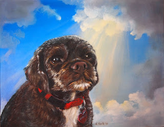
The Light of Love

Here's the finished portrait of Patches.  Strengthening the sunbeam was the final touch.  I wanted it colorful and strong, but when I first painted it it was way too colorful and way too strong.  It was at that point that I discovered a technique I should have known all along - lifting.  I used a clean brush to slowly pick up paint from the yellow portion, then used q-tips and the chisel edge of a large flat clean brush to pick up streaks, leaving clearer individual shafts.

The overall look is somewhat sentimental but I think it's completely appropriate for a portrait of a beloved pet who has passed on.

I'm happy with Patches and pretty happy with the sky.  I would like more color in the sky - peach and green perhaps - but my skills aren't there yet.  Next June I'm registered at the IAPS (International Association of Pastel Societies) conference in Albuquerque and one of the two classes I've signed up for is on painting skies in pastels.  I am really looking forward to it.  In fact, I wish it were next week, but I'll just have to wait.  Painting beautiful and dramatic skies would be a wonderful skill to have.  Meanwhile, I'll keep working on it on my own.

Thursday, October 14, 2010

The Sun Shines on Patches

I began today's session by working on the sky.  I added a sunbeam but then decided I wanted the blue at the top of the sky darker so added a glaze of Phthalo Blue.  I had too much oil in my paint and had to fool with it a bit - blotting with a paper towel, smoothing with my finger, then adding a little more paint with less oil.  In the process I got blue over the clouds and mostly lost the sunbeamt.  I tried to crisp up the edges of the clouds but the colors were mixing on the canvas so I decided I'd have to leave it for now and come back to this tomorrow.  I really want the sunbeam more intense and more colorful.

After that, I continued working on Patches herself, adding to and refining what I did yesterday then focusing on the right side of her face which I didn't get to before.  I worked on her nose, changing the color to add a brownish-red tone and adding a few shadows and highlights to better suggest the right eye.  A little brighter red added color to her collar and tag.

I don't think she looks sad any more.  To me, she has a sweet, somewhat searching look.  Perhaps she's wondering what I'm doing!  The muzzle and mouth still needs work so perhaps she will change her expression again.

When I looked at the painting last night the lower left corner bothered me so I changed the line of her back to raise it a bit.  The new part of her back will need more work tomorrow to better integrate it into the rest of her body.

Patches is a little sweetheart, and tomorrow the sun will shine more brightly on her!

The Sky Clouded Over a Bit

Today was session number 2 for Patches and I couldn’t wait to begin the clouds in the sky. It’s quite a challenge for me, but I’m happy with my progress so far. There is still much remaining: adding the sunbeams, perhaps deepening the contrast in the blue part of the sky between the top and bottom, adding color to the sunbeams, and perhaps adding more clouds. I’m looking for a spiritual feeling and keep thinking of the beautiful skies that fellow Placerville Arts Association member Bruce Gruenzel paints. He paints boats in stormy seas - scenes of deep and obvious peril - with a small bit of brilliant light falling from the dark sky - to me a clear metaphor for redemption.

How to proceed with Patches herself was unclear. One possibility would have been to refine the blocked in colors. But I was pretty happy with them so I opted for adding fur detail, beginning with the ear. I worked left to right on Patches so that I would be able to stabilize my brush hand on the dry part of the painting. I kept the lights purposefully too light to leave room for glazes of color later. After three hours I hadn’t worked all of Patches, but I did enough to be able to view it as a complete layer so quit for the day.

Tomorrow I’ll work more on both the sky and Patches but I will need to completely finish the sky first.

After I took today’s photo, I noticed that the left ear was a little too narrow and some of the curves along the edge were wrong so I quickly sketched in a correction with some Van Dyke Brown so that I’ll be off to a good start tomorrow.

Meanwhile, after painting yesterday the polymer clay was calling and I made this tiny fairy, the “Eat Your Vegetables Fairy.” For a while now I’ve wanted to make a diminutive animal using half a walnut shell for the base. By the time I finished, the walnut shell didn’t play much of a role, but I find that they make good bases - just the perfect size. I think smooth flat river stones about 1 ½” or 2” in diameter would be good too. I’ll have to keep my eyes open for some.

Tuesday, October 12, 2010

Sweet Patches

Today I started on a commissioned portrait of a lovely little dog named Patches. She led a happy life with her owner to whom she brought joy every day. Sadly, she is now passed away and I have the honor to create this keepsake in her memory. I hope to do a special job with this portrait and that Patches' spirit will guide my brush as I paint.

Here is the first layer, just blocking in the main shapes. I have big plans for the sky - clouds with the sun breaking through and casting rays around Patches. She looks a little sad at this stage, so I'll pay special attention to cheering her up as the painting progresses. Perhaps she's a little reluctant to be painted, but hopefully we'll become more and more comfortable with each other.

Sunday, October 10, 2010

Finally! A Face I Approve of!


This was my fourth attempt at a fairy face and I'm finally happy with it. I think I've figured out a few things, including the shape to start with - not a ovoid ball, but a piece pinched and prodded into something more like a head with the bottom half protruding and the forehead receding in a gentle slope. From that start, it's a matter of pinching out the nose, indicating the eye positions with the tip of the knitting needle, cutting a slit for the mouth, and forming the lips by creating a crease under the lower lip and pushing out the two halves of the top lip (with a flat tool pressing upward and the upper surface of the mouth cut).

I'm pretty clear about that part, but the eyes still defeat me. It's really hard to push them in so that both pupils are looking in the same direction. The eyes need to be set pretty deep, but setting them pushes up clay around them. You need enough to push up enough clay to form nice eyelids that are thick enough, but not so much that it distorts the rest of the face.

I find the ears pretty easy, and the only part of the head that I add on. It doesn't matter if the head is too narrow front to back because the hair will cover it. But if there's really too little, I can alwways add more without worrying about a seam (to be covered with hair). The neck is separate but not too hard.

And I finally found a base I really like - a part of a slab of redwood burl. I cut with a bandsaw then made the final more details cut on my scroll saw. It looks nice I think. I felt that it was necessary to apply a varnish to preserve the wood. Even though an oil base varnish would bring out the grain really beautifully, I didn't want to use one because it might not make a good sticking surface for the glue that I will need to attach the fairies (2-part quick set epoxy).

I keep experimenting with different ways of creating fairy hair, and this is "dyed degummed throwsters silk" which I got from Meinke Toy Fiber Art Supplies (http"//www.meinketoy.com). I really like this silk for hair. Sadly, I haven't been able to find very many colors (although the ones I've found I really like). But I also got some of the same product that isn't dyed and I'm going to try dying it with the dyes I got for painting silk scarves. More news on that later!

As always, the Fantasy Fiber wings and the jewelry were so fun to make. But the little rabbit was best of all.

I still need a title for this piece.